
Back To The Future - Design Insights
10/05/2017

The 80s are back!
Great Scott Marty, we’ve dialled the DeLorean up to 2017 but nothing’s changed?
We all know how styles come and go and if you hold on to something long enough it might just be cool again (except for Crocs, Crocs will never come back). It’s why when you were little the best thing about visiting Nana was for the boiled sweets and Sodastream, but now it’s to make sure she still has that mid-century couch you ‘subtly’ suggest you’d like to inherit.
Now it’s the 80s turn, so get your sunnies on because it’s about to get bright!
For me the 80s is best summarised with vivid pops of colour, simple patterns, D.J Tanner & Uncle Joey from Full House and the Memphis Group. The Memphis Group was an Italian design group founded by Ettore Sottsass in the early 1980s. For almost a decade they produced some of the most flamboyant and often controversial postmodern designs. Inspired by pop art a trade mark of the Memphis Group was bright colours, asymmetrical shapes and pattern.

Moving forward to 2017 we’ve seen some of these attributes come back in to design. One of the most advertised and well known is the new 2017 re-brand of MediaWorks’ Channel 3, as they transition from ‘3’ to, drum roll… ‘Three’.

Vivid colours, plenty of patterns and Samantha Hayes, what else could you ask for! As polarising as this style can be, you either love it or feel like you’ve just been punched in the face by a collision of colour, I personally am a fan. Channel Three has clearly given a nod to the past but they’ve delivered it with a well needed 2017 twist. Along with the re-release of MacGyver last year this is just one of the bigger examples of the 80s revival throughout the design world.
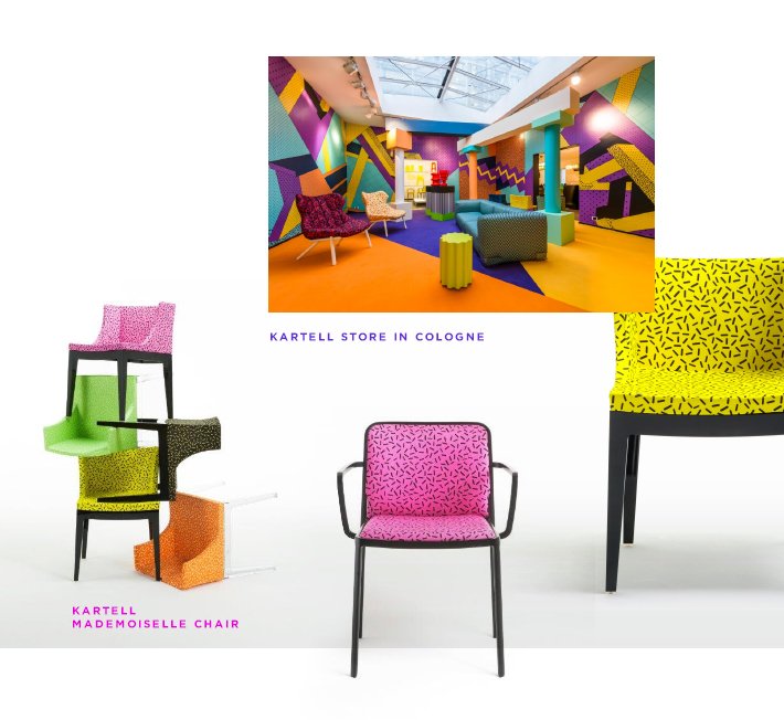
Another Memphis Group enthusiast that comes to mind is by the high-end Italian furniture company Kartell. For over a decade they’ve produced the “Mademoiselle Chair”, designed by Philippe Starck in 2003. Now in 2017 the design has been given a snazzy new knitted jersey from Nana with the combination resembling a party pill that spent a big night in Mr Whippy's sprinkle jar. Fun vivid colours and a simple pattern sit on top of an ebony base, so if you need a feature piece, this will do it!
So bright pinks, yellows, teals and patterns in mass may not be suitable for all companies and their websites but you can definitely still get on board by dialling it back and using these colours or patterns as accents to complement cleaner branding. Neon TV has been doing it successfully for a couple of years, showcasing the brighter colours against a more dramatic and dominating black.
Here’s how our banner could be treated.

With the 80s clearly upon us, I do wonder if the 90s are next? I might dust of my Charlotte Hornets hat and jacket just in case. And yes it was a legit starters hat with 8 stitches on the peak, I can hear you all asking.
Written by Kyle Turner